Tuesday, April 25, 2017

ArcCollector 2

INTRODUCTION

This lab explores geodatabase creation and data collection using ArcCollector. Unlike the previous ArcCollector lab, the area of study and theme of the project is decided by the student. The geospatial question explored in this lab was: what areas of the Third Ward in Eau Claire affected most by potholes?

An overview for the flow for the answering this question is as follows: A geodatabase was created with suitable domains, data was collected, data was brought into ArcMap, data was interpreted.

Data was collected on the following variables for each pothole:


  • Location
  • Size (in cm)
  • Cluster size
  • Overall road condition
  • Area type (Residential, commercial, etc.)
  • Traffic amount

While the data collection and interpretation went smoothly, there were some concerns that arose during interpretation. This will be discussed later.


STUDY AREA

The area of interest is a section of the Third Ward in Eau Claire, Wisconsin. This area was chosen because of the diverse road conditions, the mixture of commercial and residential properties, and the density of potholes. The study area is shown below in figure 1. The Third Ward is considered the downtown of Eau Claire. It is largely small businesses such as restaurants, bars, banks, etc. On the outer edges, particularly on the southern side of the area studied, is more residential. There is a mix of high and low traffic streets.

Figure 1: Study area


METHODS

An overview of the workflow was: geodatabase creation, setting up domains, creating fields and assigning domains, data collection, and data interpretation.

The first step was geodatabase creation. A suitable folder for the project was made, and a geodatabase was created using ArcCatalog. Next, still using ArcCatalog, domains were created. A screenshot of this menu appears below in figure 2. For each data type needed, a domain was necessary to determine the allowable values for each variable. This would minimize error. For example, the traffic amount was assigned as text, and options were given so no text had to be manually entered. Similarly, for number variables, such as pothole size, a range of allowable values were given.


Figure 2: Creation of domains within the geodatabase
Once the domains were created, a feature class was created for data collections. This feature class was assigned as points, which would be the locations of potholes. WGS1984 Auxiliary Sphere was used as the coordinate system, as this is necessary for data collection in ArcCollector. Fields were added to this feature class, and the previously created domains were assigned to fields. After this was completed, the feature class was uploaded to ArcGIS Online so it could be accessed in ArcCollector.

With the ArcCollector app installed on the iPhone used for this lab, the feature class was accessed by logging into an ESRI account. With the collection device ready, all streets within the study area were navigated and potholes were documented. An hour was chosen that would have little traffic, so the location could be collected more accurately by standing directly next to the pothole, as shown below in figure 3. For potholes on busier streets, however, the location was collected from the sidewalk. A few meters difference would have a negligible effect on the results, as it is generally within the uncertainty of the GPS signal anyway.

Figure 3: Data collection
Two screenshots appear below in figure 4 and 5 to show the interface of the ArcCollector app. When a pothole was found, the plus icon at the top of the screen was used to create a new data point. This would bring up the screen shown in figure 5, where variables could be assigned for the new data point. For variables such as TrafficRank, a list of allowable variables was shown. For number variables such as size, the value had to be within a certain range. If the value was outside this range, an error would be given.


 Figure 4: Map view within ArcCollector             Figure 5: Collecting data for a single point

Once all the data was collected, ArcGIS Online was used to download the data to ArcMap Desktop.


RESULTS

Shown below in figure 6 is a density map of potholes. The areas affected most by high pothole density are the streets with the highest traffic. This is likely due to a higher frequency of cars driving over the street causing an increased wear on the road surface.

Figure 6: Pothole density
Shown next in figure 7 is the distribution of average pothole sizes. Notice the largest potholes tend to be on the northeastern side of the study area. This area is residential with very little traffic. This makes sense, as less frequented streets will have a lower demand for fixing problematic potholes, so potholes in these areas could grow larger before there is a large demand to fix them.
Figure 7: Average pothole sizes


CONCLUSION

This lab proved to be an excellent learning opportunity. Much was learned about the theme and subject matter that can be collected and interpreted with the assistance of ArcCollector. This lab showed that data with discrete locations and mainly categorical variables are not ideal for interpolation. Turning discrete locations into continuous surfaces demands a range of numeric variables, as was learned in this lab. Adapting traffic data based on three categories (low, medium, high) into a continuous surface map is not ideal. If this lab were to be redone, a different theme would be chosen to study a variable with a more continuous nature.


Wednesday, April 19, 2017

Introduction to ArcCollector

INTRODUCTION

This lab explored ArcCollector, an ESRI app used to collect field data. ArcCollector can use crowd-sourced data and runs on any smartphone. Using a basemap, field measurements can be recorded with locational information taken through the phone's GPS. This can be used to create feature classes in the field. This data is automatically uploaded to ArcGIS Online, allowing other users to access it in real time.

In this lab, a series of attributes were created in advance, including temperature, dew point, wind speed, windchill, and wind direction. These measurements were recorded at many points throughout the study area. Using these data points, microclimates were mapped and assessed.


STUDY AREA

The study area of this lab was UWEC campus in Eau Claire. Prior to collecting the data, the study area was divided into 7 zones. The class was split into groups, each assigned to a different zone for data collection. These zones are shown below in figure 1. The zone I was assigned to was zone 3. This included the bridge connecting zones 1 and 2. Note that the Western section of zone 3, from the bridge over, was under construction and access was not possible. Measurements were taken on an overcast, ~50°F day.
Figure 1: The study area, divided into 7 zones used in data collection


METHODS

The equipment used in this lab were an iPhone, a Kestrel 3000 handheld weather station, and a compass for determining wind speed. Two people were assigned to each zone, so I had one other person collecting data in zone 3.

To collect data, the ArcCollector app was used with the project opened. For each data point, measurements were read off the Kestrel and entered into a new data point on ArcCollector. Temperature, dew point, and windchill were entered directly. To find wind speed, the Kestrel was held vertically, perpendicular to the wind direction. Once the wind speed stopped climbing, the measurement was taken. The direction of the wind was measured using a compass. The Kestrel is shown below in figure 2.

Figure 2: The Kestrel handheld weather station measuring wind speed
In figure 2, wind speed is being measured through the use of the fan. Notice the coil underneath the fan. This collects temperature information. Cycling through the available measurements was done using the arrow buttons.

Measurements for each attribute were held to domains assigned to the feature class before collection began. Examples of these domains are limiting wind direction from 0 - 360 degrees, limiting temperatures to only reasonable values, etc. This was done to prevent some user error, for example if someone hit an extra number when entering temperature, entering it at 500°F instead of 50°F, an error window would come up to tell them there is incorrect data entered.

As data was collected, it was uploaded in real time to the database. This was easily seen in ArcCollector, with new data points popping up across the study area from each classmate collecting new points. Once data collection was complete, the data was downloaded onto ArcMap and surface maps were created.


RESULTS

ArcGIS online was used to download the data to the desktop ArcMap. The collected data contained 239 points. Interpolation was needed to create a continuous surface to better represent the data. Several methods were tried, and the kriging method turned out to be the best option. The results from kriging showed more detail than other methods tried. The first map created was a temperature map, shown below in figure 3. The maximum variance in temperature was less than 7°F. As mentioned, the day was overcast, so there were no drastic variances from sunlight and shadows. A sunny day would likely create more interesting data. That being said, there are some slightly warmer sections of the campus shown below, mainly in pockets along the southern edge of the study area. Note that the study area shape has been simplified. This was done to make the surface gradient seem less choppy and disconnected.
Figure 3: Temperature map of UWEC

The next map created, shown below in figure 4, is the windchill map. Notice the similarity between this and the temperature map. They are almost identical besides the slightly lower minimum temperature on the windchill map. Warm and cold pockets are still found in the same areas with similar shapes and magnitudes.

Figure 4: Windchill map of UWEC

The next map created was the dew point map, shown below in figure 5. This map has similar distribution to the previous two, but is not identical. Notice two warmer pockets are found on the eastern section, similar to the other maps. The pocket on the southwestern section does not appear in the dew point map, however.

Figure 5: Dew point map of UWEC

The last map created was the wind map, shown below in figure 6. To create this map, raster surface maps were created for both wind speed and direction. This was done using the same kriging method as the previous maps. Once these were created, The raster was symbolized using symbols instead of a gradient. Once the direction was symbolized as arrows, the wind speed raster was used as a reference for the arrow magnitude. Notice the wind direction is mostly headed northwest, with the exception of some areas near the southern section. This could be explained by the hill that is found there. As for wind speed, the largest magnitudes are found in the western section. This is likely because this part of campus is more open, with less buildings and trees to block wind.


Figure 6: Wind speed and direction


CONCLUSION

This lab served as an introduction to ArcCollector. This app will be explored in more detail in a subsequent lab. ArcCollector proved to be a powerful, yet simple tool for data collection. Using smartphones as a data collection device is a creative solution, as smartphones are readily available and have powerful GPS capabilities. It should be mentioned how useful it was for domains to be set up before data collection. This definitely cut down on user error and simplified the process. The app itself was easy to use and allowed the data collection from other groups to be seen in real time.


Tuesday, March 28, 2017

Distance Azimuth Tree Survey

INTRODUCTION

This lab involves taking an implicit survey. Whereas an explicit survey relies on coordinates that locate a specific point on the planet, implicit surveys identify locations  in comparison to their surroundings. In this case, coordinates were found for an origin point and locations of trees were found in relation to that point. This involves recordings a distance from point to tree as well as an azimuth, or bearing.

The survey was conducted on the Putnam Trail that runs on the southern side of the UWEC campus. This trail runs through a forested area. Select trees in this area were used in the survey.

Figure 1: the study area on the UWEC campus in Eau Claire, WI


METHODS

Three different methods for finding distance and azimuth were used. Each method used different equipment to take measurements. The only part that is kept constant through all methods was measuring the coordinates of the origin point and how the tree diameter was measured. The origin point coordinates were all measured with a GPS. Tree diameter measurements are shown below in figure 2. A tape measure was wrapped around the tree and the circumference was recorded in centimeters. This would later be divided by pi to get the diameter.

Figure 2: Measuring tree circumference with a tape measure

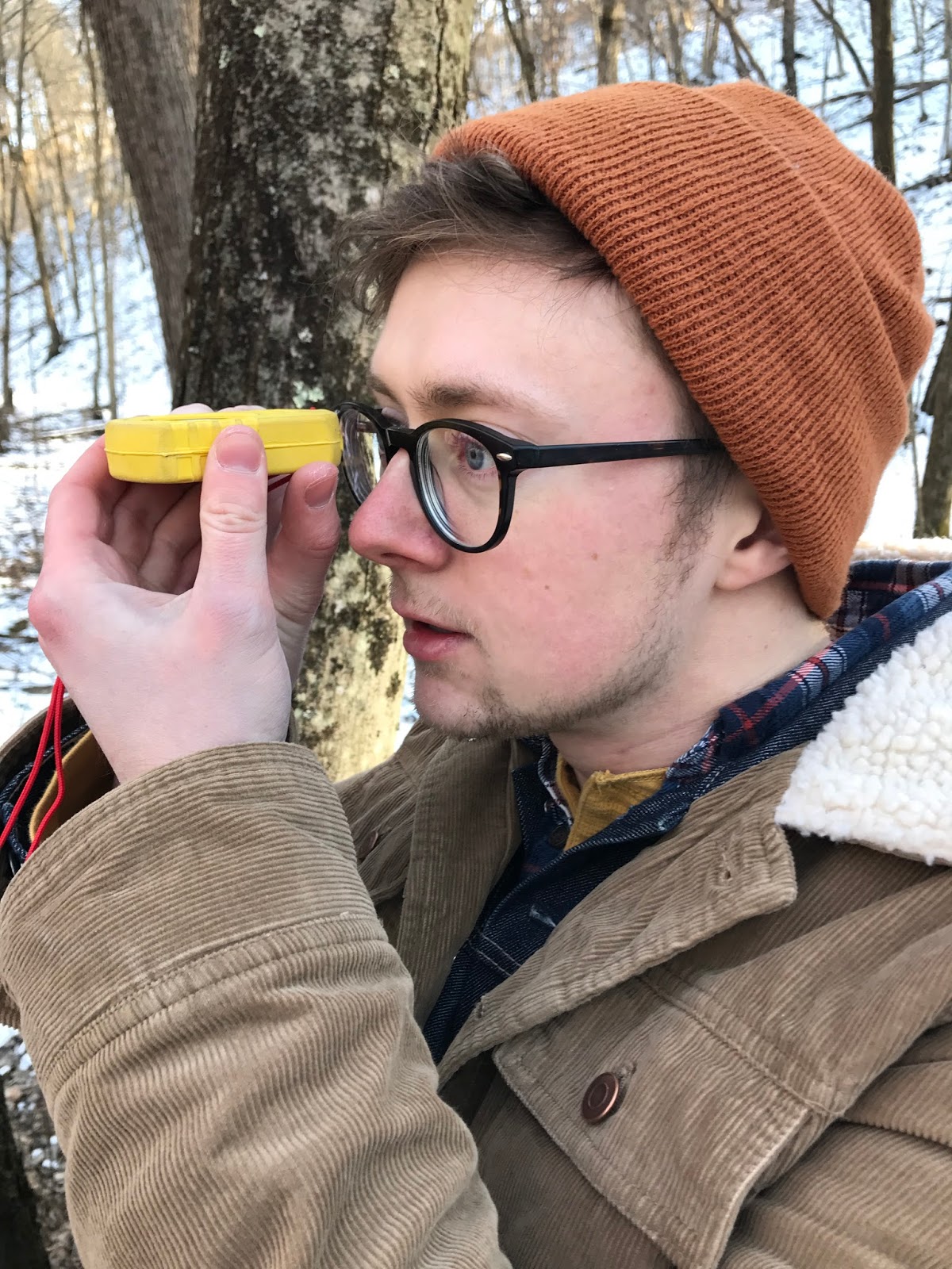
  • The first method involved measuring distance from the origin point to the tree with a tape measure and measuring the azimuth with a compass. The compass was specially designed for surveying, and involved looking through a small hole towards the target. The opening would have the bearing of where the compass was pointed. This is shown below in figure 3. While this was the most time-consuming of the three methods, it could be conducted with the least advanced equipment. Tape measures and compasses are readily available, so this survey method is the most accessible.

Figure 3: Using the survey compass


  • The second method replaced the tape measure with a distance measuring device. This included two parts: a device at the origin point aimed at the tree of interest and a device that was held at the tree that was the reference for the distance measurement. Pictures of these being used are shown below in figure 4 and 5.

Figure 4: The user held this device at the origin point and
aimed it at the target. The distance was displayed on a screen
Figure 5: The user held this device at the target tree

  • The final method used a more advanced device that simplified the procedure. This device was aimed at the target tree from the origin point and the distance and azimuth were displayed. Using this to take measurements was faster, simpler, and could be done with a single person. However, this device is an expensive piece of surveying equipment, so this method is not very accessible outside of professional surveys. The device being used is shown below in figure 6.

Figure 6: While standing at the origin point, this device displayed
distance and azimuth to where it was point pointed

Once all measurements were taken, they were entered into a spreadsheet that contained X, Y, azimuth, and tree diameter (converted from the circumference measurements). This table was brought into ArcMap. The Bearing Distance to Line data management tool was then used to convert the table into visual geographic data saved as a shapefile. This method, however, created lines from the origin point to each tree recorded. The get the trees as points, the Feature Vertices to Points data management tool was used to convert the vertices of these lines to points. This created points at the origin, however, which were then deleted, as the origin points were not surveyed trees. A visual representation of this procedure is shown below in figure 7.

Figure 7: first the table was converted to bearings, then points were extracted from these lines,
then the origin points were removed so the tree locations could be displayed


RESULTS

The final map created is shown below in figure 8. The results appear reasonable at first glance. The tree groupings for each method appear to be at approximately the right locations and scale. Each of the three survey methods were conducted at a distance from one another. However, two of the surveys were taken with the origin point on the trail directly. These are the middle and western groupings. They appear to be offset from the path. This is shown in figure 9.

Figure 8: the map created from the survey showing tree locations and diameters
Figure 9, below, shows the origin points and how their locations appear to be off the trail, when in reality they were on the trail. An incorrect recording of the origin point shifts all the trees that were referenced to that point. So while the tree locations are still correct in reference to the origin point, they are all shifted from their actual locations. Note that the arrows show the approximate locations where the points should be. These were decided on be observations at the time of the survey, so they are not exact. The eastern most origin point could be incorrect, also, but since the point was not taken on the trail it is difficult to estimate.

Figure 9: The approximate error in the origin points is shown
The cause of this error is most likely user error when reading the GPS to find the coordinates of the origin point. It is also possible that the GPS was not calibrated correctly, but given the origin points are not offset by a constant bearing and distance, it is more likely user error.


DISCUSSION

As mentioned before, this survey created implicit data. This is more prone to error since locations are not referenced on a fixed system like global coordinates. Referencing measurements to other measurements allows for error propagation. As shown in this survey, a single incorrect measurement of an origin point meant all measurements for tree locations based on that point were also incorrect.

The three methods used demonstrated the relationship between specialized equipment and ease of use. The more specialized and technologically advanced the surveying equipment was, the easier it was to use. However, the more specialized and advanced the equipment is, the more difficult it is to procure. A tape measure and compass are readily available, but a laser surveying device is not. As with anything, there are trade-offs that must be considered and tailored to specific tasks.


Saturday, March 11, 2017

Introduction to Pix4D

OVERVIEW OF PIX4D

Pix4D is a complex mapping software used to process drone imagery for photogrammetry, point cloud creation, DSM creation, modeling, and more. This is done by processing overlapping aerial imagery for 3D analysis. The software finds differences in the ground images from multiple angles to determine heights of features. This is done on millions of points across a study area to create a point cloud of the surface of the ground. The software also uses this information to pinpoint the location of where the photo was taken, correcting for any error in the recorded location.

All of this is done through powerful algorithms within the program. Despite how complex the software is, the user interface is fairly straightforward and user-friendly.


USING PIX4D

A survey would generally begin with finding a study area, planning the survey, and executing the survey. In this lab, however, the aerial images were given. The study area in this survey was Litchfield Mine, located Southwest of Eau Claire, WI. This is shown below in figure 1.

Figure 1: Location of Eau Claire County (left) and location of Litchfield Mine within the county (right)
68 aerial images were given with significant overlap between the images. The more overlap between images, the more precise the software can be with modeling.

To process the data, a new project must be made. It is recommended to be descriptive when naming the project, including the data, location, sensor, and altitude. The images are then uploaded to the new project. Giving the location is not necessary in most cases, as the photos are automatically geotagged when they are taken. Some default values must be adjusted, however. In this case, the shutter type had to be adjusted from the default value, global shutter, to the actual shutter, rolling. The other parameters could be left alone in this case. The coordinate system can be changed from the default (WGS84) if necessary. Next, a project template must be chosen. These will give different output images and models. For this project, a generic "3D Maps" template was chosen to give an orthomosaic, DSM, 3D mesh, and point cloud.

After the project creation is complete, you can view preliminary data for the project. This will show you the location of the study area and give you an idea of the quality to expect. From here initial processing can be started. Once this is finished, a quality report is given. A screenshot of this is shown below in figure 2. This gives preliminary data before the bulk of the processing is done. If this determines the data quality to be insufficient, the processing can be stopped before time is wasted to create poor results. Notice below, the report gives a preliminary orthomosaic and DSM along with basic information about the study area.

Figure 2: Screenshot of the first page of the preliminary quality report
The report gives graphics and information about quality checks and corrections done on the data. A useful graphic that was given is shown below in figure 3, and shows the overlap between the images. The more images that overlap, the better the modeling will be. The majority of the study area in this project has significant overlap, which is good.

Figure 3: A screenshot of the quality report showing overlap in the study area
After the initial quality report is determined to be good, the rest of the processing can be started. Once this is finished, another quality report will be given. This one is similar to the last, only with more precise calculations. The point cloud is also completed at this point and can be viewed. A screenshot of this is shown below. This screenshot shows the study area as viewed at an oblique angle. This can be rotated, panned, and zoomed. Notice on the left side there are options to view the model differently, such as a point cloud, or to view the locations of the drone at each image capture.

Figure 4: Screenshot of the completed model, as shown as a triangular mesh

These models were output into the project folder upon completion of the processing. These can be used in other programs such as ArcMap. This was done to create maps of the orthomosaic and DSM images, as shown in the results section.

This process created quality orthomosaic and DSM images. This is a small subset of what Pix4D is capable of. It can also be used to analyze different types of data, such as thermal images, take measurements, such as distance and volume calculations, and more. If images are not geotagged, Ground Control Points can be used to calculate locations of the images.


RESULTS

The final orthomosaic and DSM images were imported into ArcMap. The orthomosaic image is shown below in figure 5. Notice there are no seams from where the 68 images were patched together. The entire image is also a direct overhead view without oblique distortions. This accuracy allows for distance and area calculations.

Figure 5: Map showing the orthomosaic image
Shown below in figure 6 is the DSM map. Notice the edges of the data have some artifacts. This is a result of there being limited overlap on the edges so height calculations could not be process with the same level of accuracy. The majority of the image is very accurate and crisp. Note that this is not the original DSM, as a hillshade image has been created to make it appear more three-dimensional.

Figure 6: Map showing the DSM image

Lastly, two videos of a fly-by over the study area is shown below in figure 7. These were created within the Pix4D software. The first follows a custom overhead path. The second shows the study area at an oblique angle. The study area appears three-dimensional in these videos, as a mesh was used as the model. Flyovers following the original drone path can be created, along with walk-through videos where the camera moves at ground level.


DISCUSSION

Despite only using a small subset of the capabilities of Pix4D, it is clear that it is a powerful and easily learned program. Worth noting is that even in the small study area used in this lab, the processing time took a while. On a much larger project, either a more powerful computer or patience would be necessary as the processing could take days or weeks.


Friday, March 3, 2017

Creating a Navigation Map


INTRODUCTION

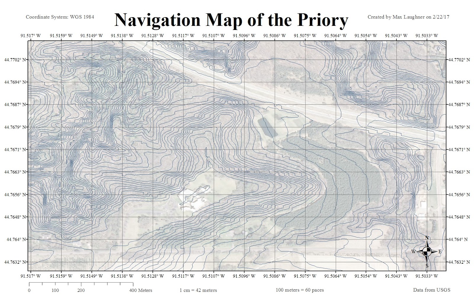
The goal of this lab was to create a navigation map to be used at a later time. A navigation map is used to help a viewer navigate an area. This is made easier using a grid system so the viewer can easily locate where they are and where they're headed.

An important aspect in the creation of a navigation map is the choice of a coordinate system. A coordinate system is a reference system for the planet, making it possible for every position on the surface to be represented by identifying numbers. These can be geographic coordinate systems, which use coordinates, or projected coordinate systems, in which the planet is mathematically transformed into a planar surface. The second uses a standard unit such as meters for measurement. In this lab, both types of coordinate systems will be used.


METHODS

A navigation area was given for this exercise, which was the Priory in Eau Claire. A DEM that was given was used to create a contour map. First, the DEM had to be clipped down to reduce processing time. Once this was done, a tool was used to create the contour map from the DEM. The contour overlaying the DEM from which it came is shown below.

DEM of the study area with the contour map created from it

Notice the resolution of the DEM is not very high, but the contour map created from it still looks usable. A higher resolution DEM was available, but the coordinate system was unknown and it contained no metadata, so it was not usable. The contours are 2 meter separation, which seemed to be the best option. Any higher and the map became too busy, and a lower interval didn't give enough information.

Next, a coordinate system was needed. One map would need to be in degrees in the other in meters. The map in degrees was given WGS 1984 coordinate system, while the map in meters was given UTM Zone 15N.


A crucial part of a navigation map is readability. The map needed to include:

  • North arrow
  • Scale
  • Projection name
  • Grid with labels
  • Background
  • Data sources
  • Watermark
  • Pace count

These were composed for easy readability. For a background for the map, I gave it satellite imagery from the area. This was made partially transparent so it did not distract from the topographic lines and grid.


RESULTS

WGS Map

Shown below is the map in degrees. Notice the degree decimals go out to enough digits to provide the necessary information, but not more than that. Any more decimals would become too busy and provide unnecessary accuracy. Similarly, the grid spacing was chosen to provide enough information without becoming overwhelming. The imagery is present behind the topographic lines to provide context.


UTM Map

Shown below is the map in meters. As discussed before, a key component of navigation maps in readability. The last few digits of the meters in the grid labels are bolded, as they are the only numbers that change across the study area. Note that this UTM map is less narrow than the WGS map. This is a result of the different projections.


CONCLUSION

Important components of navigation maps were explored in this lab. It is important to display enough information on these maps to be useful, but not so much information that it becomes difficult to interpret. These maps are intended to be read in the field, so readability is key.

Wednesday, March 1, 2017

Survey123 Online Tutorial


INTRODUCTION

Survey123 is an ESRI app used for gathering field data with a smart phone. This is an outline of the tutorial for Survey123 that was followed. The tutorial was provided by ESRI through the learn.arcgis.com website.


OUTLINE

First, a new survey was started. After its creation, sample questions were added to the survey of various types. This included simple text answers, numeric answers, geopoint, multiple choices, and others. The options for questions are shown below. All screenshots are taken from the Survey123 program.


Options for survey question types


The tutorial instructed that the survey include emergency preparedness questions. Twenty-three questions were added in total. After the questions were finished, the survey was then published. This made it available to be completed. The screenshot below shoes what the survey looked like on a computer.

A sample of the survey viewed on a computer

The survey could also be completed on a handheld device with the help of the Survey123 app. THis was downloaded and the survey was completed on a smart phone. A screenshot of how the survey looked appears below. Notice it follows the same format and looks similar to how it appears on a computer.

A sample of the survey viewed on a smart phone

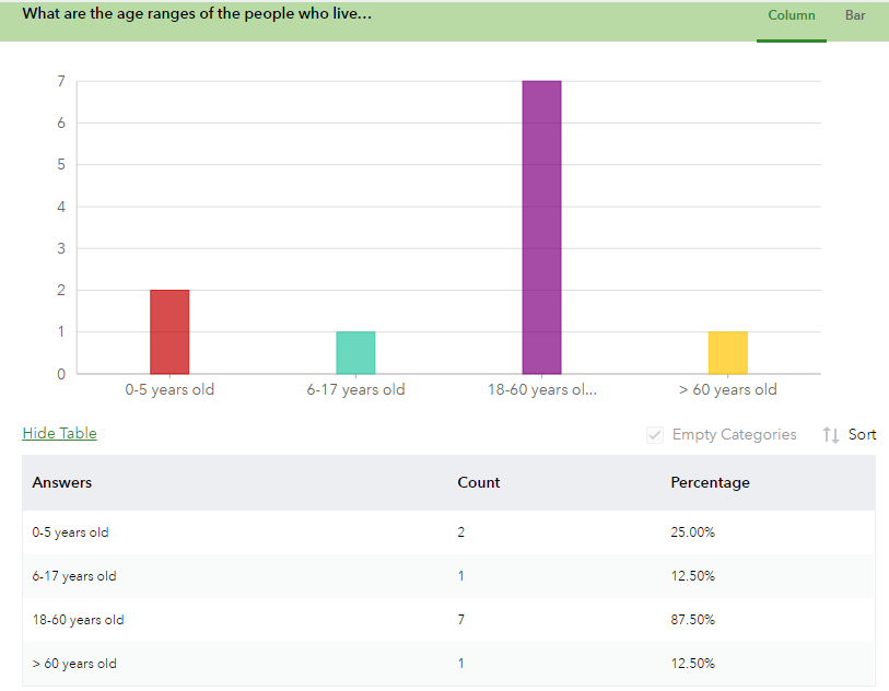
After the survey was completed 8 times to have some sample data, the analysis capabilities were ready to be explored. This included overviews of all the questions and how they were answered. A screenshot showing one question is shown below. Depending on the question type, different information was provided. Notice below, in a multiple choice question, the counts and percentages of each answer are shown. Numeric answers had averages and sums calculated.

A screenshot showing analysis capabilities of Survey123

Another capability of the program was showing all answers for a single survey participant. This was done by showing a map locating all participants in the survey. The answers for each participant are shown at once, rather then overviews of each question like in the previous view. This is shown below.

A screenshot showing locations of survey participants and what each participant answered

Lastly, the tutorial instructed on how to bring the data into ArcMap Online. This allowed for viewing it on a map with drop-down displays of each participant. From there, the data could be shared and published.

Since the survey was completed fairly randomly just to get sample data to work with, there were no overall trends or patterns, other than that all of the data came from Eau Claire, as displayed on the map above. With a larger participant base and questions that were relevant to the area, this software could easily be used to view trends and patterns.

This software would be very useful in studies of populations. This could also be used in geographic surveys, where the surveyor enters the measurements they take. The appeal of this software is that it is easy to use and requires no specialized equipment or knowledge to use it.


Tuesday, February 21, 2017

Cartographic Fundamentals


INTRODUCTION

The goal of this lab was to learn the fundamentals of properly displaying data. This includes attaching the proper information to the data for it to have context and be useful. The sandbox data from the previous labs will be revisited and displayed in a more useful way. Following that, several maps were created of Hadleyville Cemetary in Eleva, Wisconsin to display several different variables.


METHODS

Arcmap was used to create all maps in this lab. The sandbox map had some supplemental work done in Adobe Illustrator to put in the scale bar and the origin points. For the cemetery maps, symbology tools were used to display the various features.


RESULTS

Displayed below (Figure 1) is the revised sandbox map. This was created using the spline method from the previous lab. Added to this map was a title, location map, north arrow, scale bar, and map information. These additions add context to the map to make interpreting it easier. On the right side of the map, four different three-dimensional views. The origin point on the 3D views allows the viewer to more easily see where the orientation is being viewed from.

Figure 1: Map of sandbox data created using the spline method


Next are the maps of Hadleyville Cemetery. These also have the same necessary cartographic features added. First (Figure 2) is a map showing year of deaths (YOD) in the cemetery. This method of displaying the year of each grave is good for checking individual dates with good accuracy, but it is difficult to see general trends.

Figure 2: YOD displayed individually


The next map (Figure 3) shows the same information, YOD, displayed in a different way. This map displays the information as graduated circles, with larger circles representing later years, as it shows on the legend. This method of display more easily shows general trends in the data, but if you wanted to know the exact year of a grave, this map would not be suitable. As you can see from the map, newer graves tend to be grouped together and closer to the outside of the cemetery.

Figure 3: YOD displayed by graduated symbols


The next map (Figure 4) shows last names on graves in the cemetery. This is displayed similar to Figure 2, in that each grave has its information individually displayed with no need for a legend. Unlike Figure 2, the information provided in this map is not numeric so the option so symbolize the data using other methods is not viable. There is too much of a variety of last names at the cemetery for them to be cleanly symbolized by type.
Figure 4: Last names displayed indivudually


Lastly, Figure 5 shows a map showing the condition of each grave. Since there are only three options: standing, not standing, or unknown, this is easily symbolized by different color symbols. Notice there are only a few graves that are not standing. There are also many graves that had null values in grave condition, so they are represented as having an unknown condition.

Figure 5: Grave conditions


CONCLUSION

Without metadata, most maps are rendered useless. This data provides context for the viewer to interpret the map, such as location, orientation, what the map is showing, and where the data is from. These map elements will be used in all subsequent labs.


Field Navigation

OVERVIEW This lab involved navigating a wooded area, known as the Priory, in Eau Claire, WI. To navigate, a navigation map made in a previ...